- The Story Behind the Hip Heads Logo: A Symbol of Inclusivity and Innovation
At Hip Heads, our mission is to create accessories that everyone can enjoy, regardless of gender or background. This commitment to inclusivity and innovation is perfectly captured in our Hip Heads logo, which we designed to embody the essence of our brand and its origins. Let’s take a closer look at the thoughtful details and symbolism behind our unique logo.
A Neutral and Inclusive Design
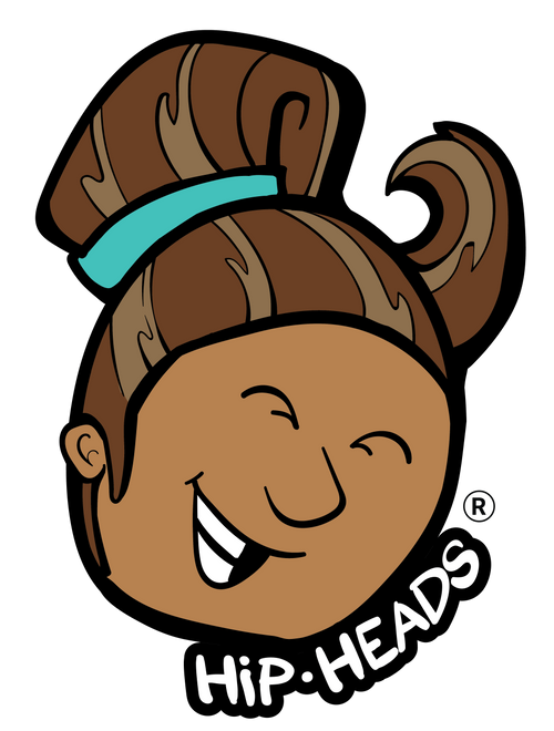
Our logo features a face with neutral features and skin color, intentionally designed to be perceived as a guy, a girl, or however the viewer imagines. This neutrality is key to our brand’s identity, reflecting our belief that style and beauty are universal and not confined to specific genders or appearances.
The Hair Tie: Where It All Began
Central to our logo is the hair tie, a symbol of the product that started it all for Hip Heads. Our Hair Tie bracelets are more than just functional accessories; they are stylish, versatile, and a testament to our commitment to high performance quality. By incorporating the hair tie into our logo, we pay homage to our roots and the innovative spirit that drives us forward.
The Ocean Wave Hairstyle: A Nod to Nature and Movement
The hairstyle depicted in our logo resembles a wave in the ocean, symbolizing the fluidity, movement, and natural beauty that inspire our designs and how the hair moves. The ocean wave represents the ever-changing and dynamic nature of fashion and personal style, reflecting our dedication to creating products that adapt to and celebrate individuality within the outdoor hobbies and activities we love to enjoy.
Beyond Hair Ties: A Brand for Hair, Head, and Skin
While our journey began with hair ties, we have big plans to evolve into a national brand offering a wide range of accessories for the hair, head, and skin. Our logo encapsulates this broader vision, symbolizing our diverse product line in which we tend to go. Each product is designed with the same attention to detail and commitment to quality that our customers have come to expect from us.
Celebrating Individuality and Community
The Hip Heads logo is more than just a design; it’s a celebration of individuality and community. It invites everyone to see themselves in our brand and join a community that values inclusivity, creativity, and self-expression. By representing a face that can be seen in many ways, our logo breaks down barriers and fosters a sense of belonging for all bringing people closer together of all backgrounds.
Looking Forward
As we continue to grow and innovate, the Hip Heads logo will remain a central part of our identity. It reminds us of our beginnings, our values, and our vision for the future. We are committed to expanding our range of accessories while staying true to the principles of inclusivity and quality that define us.
Conclusion
The Hip Heads logo is a powerful symbol of who we are and what we stand for. With its neutral design, ocean wave hairstyle, and iconic hair tie, it captures the essence of our brand: innovative, inclusive, and rooted in quality. As we plan to expand our offerings to include a wide range of accessories for the hair, head, and skin, our logo will continue to represent our commitment to celebrating individuality and fostering a sense of community. Join us on this HIP journey, and let’s embrace the beauty of diversity together.
KEEP IT HIP

